Empowering Nursing Professionals: Enhancing Engagement and Knowledge Sharing on Highnote
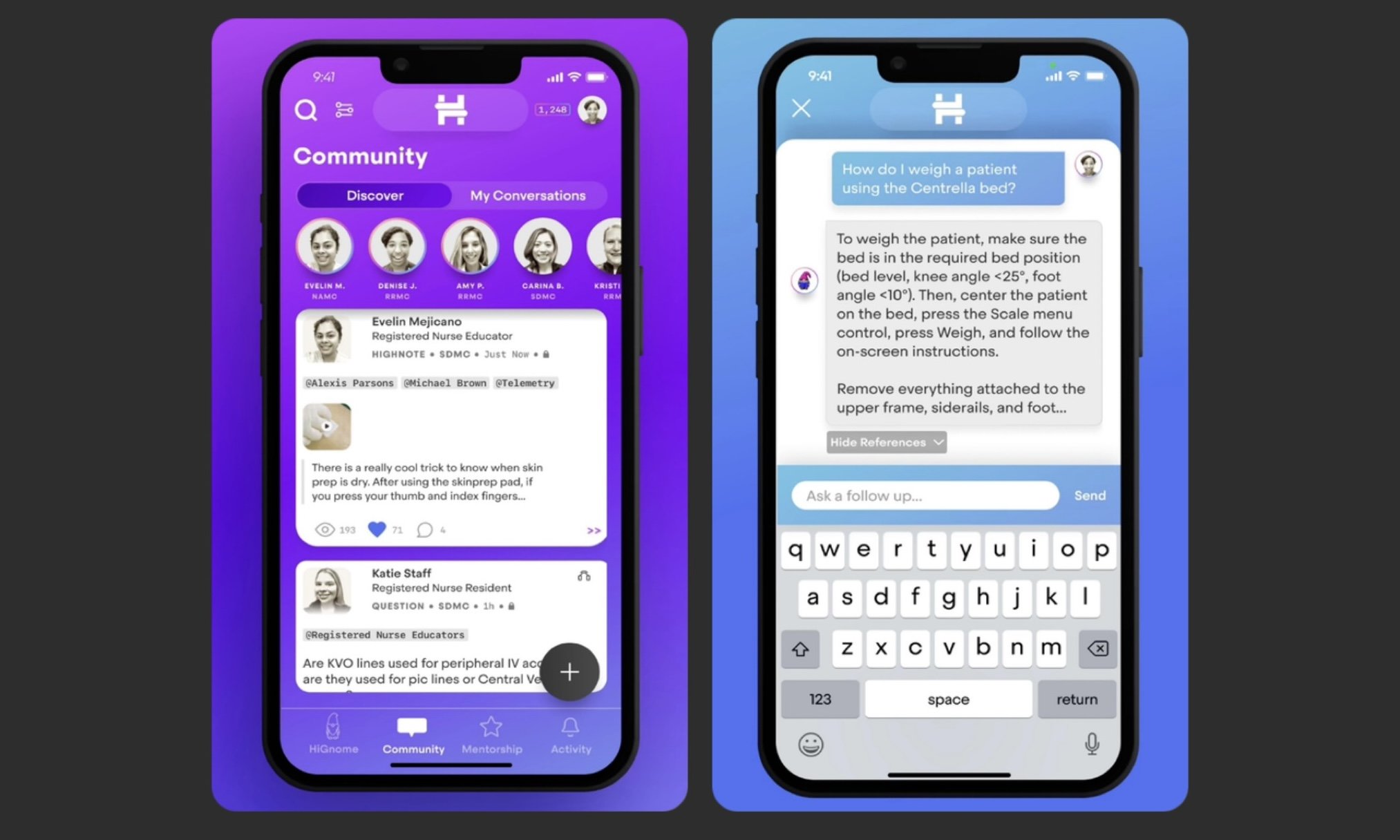
Highnote serves as an application tailored for nursing professionals, offering a real-time platform for the swift exchange of job-specific insights. Highnote responds to a pressing need observed through prior research, which found that a significant proportion of inquiries from junior nurses while on duty remain unaddressed, potentially impacting patient care. Highnote's objective is to boost nursing job fulfillment and elevate the quality of patient care by empowering nursing staff with the means to efficiently share educational information.
Project Overview
CHALLENGE
Highnote’s platform is designed to facilitate communication and knowledge sharing among healthcare professionals. However, they’ve been having trouble understanding the reasons why junior nurses weren’t actively participating by asking questions.
SOLUTION
To explore this issue, my team and I conducted research and usability testing, revealing insights into the dynamics within nursing teams.
ROLE
UX Designer, UX Researcher
TEAM
Julia, Leah, Krish, and Andrea
TIME
12 weeks
TASK
Identify reasons that junior nurses are not asking questions on the app and what would incentivize them to do so.
TOOLS
Miro, Zoom, Google Software
Background
The current application permits nurses to pose questions using video snippets, audio recordings, or text. When choosing the text option, inquirers have the option to remain anonymous. Responses, however, are attributed and originate from seasoned nurses with approximately 8-10 years of experience. Typically, inquiries receive responses within a 24-hour timeframe, generating a valuable information thread for future reference.
Highnote has observed significant engagement mainly from experienced nurses, who display a strong willingness to assist and address questions. Currently, there are no incentives in place to encourage user interaction with the app. Nonetheless, junior nurses seem to be less active in seeking answers through the application, despite prior research indicating their potential inquiries. Highnote aims to bridge this gap, promoting increased utilization among junior nurses seeking valuable insights.
Highnote introduced its platform to us in a presentation during my team’s Design Research class, the app is designed to facilitate communication and knowledge sharing among healthcare professionals. In this presentation, the focus was on understanding the reasons why junior nurses weren’t actively participating by asking questions. During this time, we asked Highnote questions To explore this issue, my team and I conducted research and user interviews, revealing insights into the dynamics within nursing teams.
This was my first experience taking on a service learning opportunity at Austin Community College, it was daunting for me to work with and for actual clients. Our research would be used to create and better their app, so it was exciting for me to talk to nurses and figure out what ways I could improve their line of work.
Research
Research Goals
Our research will focus on the behavior of nursing professionals and their assessment of the current state of educational information sharing in the field. I mainly focused on our overall objectives for the team. I wanted to make sure our objectives prioritized the issues Highnote came to us with along with understanding the challenges our users face while being on the application. We split our objectives into three categories: Overall, UX, and Business Objectives.
-Identify how nurses are currently exchanging educational information.
-Evaluate any possible pain points nurses have with exchanging educational information.
-Describe possible incentives to share educational information in one way or another.
-Evaluate the need for nurses to have new methods of receiving answers to questions.
Our UX objectives revolve around identifying issues or challenges that users encounter when seeking information through the Highnote app or their preferred communication channels. Additionally, we seek to identify potential motivators that would encourage users to engage with the app. The ultimate aim is to leverage these findings to provide concrete, practical recommendations to stakeholders for enhancing the application's user interface and functionality.
Our primary business objectives are to enhance nursing staff job satisfaction and elevate patient care by equipping them with efficient tools for the swift exchange of educational information. Furthermore, the aim is to promote a culture where nurses actively utilize the application to ask questions.
Provisional Personas
Using the insights gained from secondary research, I created provisional personas to quickly identify Manoa’s potential users. These provisional personas helped set the criteria for my interview participants and would be validated through user interviews.
User Interviews
Now, it was time to validate these provisional personas through user interviews with Manoa’s customers. During these interviews, I asked open-ended questions to learn as much as I could about their experiences and identify what the user’s needs truly are.
I conducted interviews with 5 people, about 15-20 minutes each.
Some questions asked during the interview:
How often do you visit bakery cafes?
Tell me about how you typically discover new local food businesses.
What motivates you to try a new local food business?
Why do you visit bakery cafes?
What factors influence your decision on which bakery cafe to visit?
Tell me about your most recent experience at a bakery cafe.
After conducting these one-on-one sessions with the participants, I wanted to take all this new information gained and synthesize it to better understand who the users are.
Empathy Map
Using an empathy map, I synthesized all the information I gathered during the user interviews to uncover key insights that led to identifying Manoa’s target user group.
First, I started by categorizing my notes into the categories of Doing, Thinking-Feeling, Seeing, Hearing, Gains, and Pains to get an overall understanding of everything learned during my interviews with the different participants.
Tastes & Preferences
Many people discussed being influenced by being able to find something they like
Word of Mouth
Many people mentioned trying new things based on what other people say
Proximity
People expressed their preference to going to cafes that were close to their current location
Pictures
People shared that images were one of the decisive factors when trying something new
Insights
People choose to go to the bakery cafes that fit their tastes/preferences the best
People trust what other people have to say about something
People frequent bakery cafes that are conveniently located to them
People want their food to not only taste good, but to look good
Needs
To know what kind of food the bakery cafe offers
To know what other people think about something new
To know where a bakery cafe is located
To be able to find pictures of the cafe’s food
Define
Defining the Problems
Now that we identified our target user, Ashley, it was time to identify what actual problems we are solving for based on what we have learned about our user.
To help define these problems, I used the insights gained from research and my understanding of Ashley’s needs to create POV Statements to frame the problem from the user’s perspective. I used these POV Statements to identify How Might We questions which would fuel my process to brainstorm solutions.
Ideation
Brainstorming
Now that I knew what problems we needed to solve for Ashley, I started my brainstorming process to come up with solutions to those problems. I used the HMW questions that I identified and used those to help me brainstorm different ideas through mind mapping.
From brainstorming, I ended up with a lot of different ideas - now I wanted to strategize and determine which solutions we should prioritize to most effectively help Ashley meet her goals.
Project Goals
Before I could make any decisions on what kind of solutions we wanted to implement, I needed to have a clear understanding of the goals we are trying to meet. These goals would help guide the decisions made moving forward to ensure we are moving towards the right direction. Business Goals/User Goals
Heuristic Evaluation
Based on the goals I defined, I started making decisions on what solutions we would prioritize and implement in order to successfully and effectively meet those goals.
Information Architecture
Site Map
Focusing on the prioritized solutions, I created a site map to help define the overall structure of the content on Manoa’s website in a way that would be logical and easy to navigate for our user.
Task Flow
Next, I wanted to learn how the users would be interacting with Manoa’s website. I started by identifying the key tasks Ashley would be completing on Manoa’s website, based on her goals, and the key pages and detailed requirements that would help her complete those tasks outlined in a UI Requirements document.
Using these key tasks identified based on Ashley’s goals, I started to explore how Ashley would interact with the website to complete these tasks by creating task flows.
User Flow
In order to empathize with Ashley further, I created user flows in order to better understand her overall journey interacting with the website - taking a step into her thoughts and the different decisions she would make while trying to complete tasks in different scenarios.
Design
Lo-Fi Wireframe Sketches
Taking what I’ve learned throughout my process to this point, I started to make decisions on how the content on Manoa’s website would be organized based on the project goals we want to meet.
Mid-Fidelity Wireframes
Taking the lo-fi wireframe sketches, I digitized them on Sketch and added just enough information for users to be able to navigate through the pages and complete tasks I would present to them during usability testing. These mid-fidelity wireframes would help my focus on what needed to be improved in terms of the functionality of my design. I also created tablet and mobile versions to make sure that the design is responsive and effective across the different device screens that users would be accessing the website on.
Mood Board
To begin the branding process, I started by creating a mood board for inspiration and to set the direction that I wanted to take Manoa’s branding. I focused on finding different elements (color, typography, imagery, and logos) that aligned with their brand attributes: tranquil, homey, friendly, and contemporary.
Style Tile
Now I worked on compiling everything together and defining the specific direction we will be taking for Manoa Bakery Cafe’s branding. Each decision we made for the branding elements were based off of effectively communicating their brand attributes.
High Fidelity Wireframes
Incorporating visual elements in line with Manoa’s branding, I worked on the UI design of the website and created high fidelity wireframes.
Prototype & Test
Prototype
With the completed mid-fidelity wireframes, I built a limited functionality, desktop prototype on Invision which I would use to help test my design with users.
Usability Testing
With my prototype completed, I started working on a test plan to guide the testing that would be conducted. I then recruited participants and conducted usability testing in order to see how users interact with my design and identify where improvements to the design can be made.
Test Objectives
Test if users can easily complete the tasks
Observe the different paths users take to complete tasks
Assess areas of improvement to improve the usability of the design
Tasks
We asked the participants to complete tasks such as:
Learn more about Manoa Bakery Cafe’s background.
Find out where Manoa Bakery is located.
See what kind of desserts Manoa offers.
Summary
We conducted testing with 5 participants to made observations on how they interacted with the prototype and completed the tasks.
Method: Remote, moderated usability testing (Think Aloud)
Participants: 5
Age: 25-30 years
Average Time: 7 minutes
Task Completion Rate: 100%
Error-Free Rate: 99.4%
Affinity Map
To get a better understanding of all the observations from testing, I used an affinity map to synthesize my findings. This helped me to get a better look at the different experiences users had and allowed draw connections and uncover key insights. These insights would help me identify what improvements would need to be made on our design to make sure we are helping our users painlessly meet their goals.
Amongst the patterns I uncovered, I was able to identify common pain points amongst our participants.
Pain Points
3/5 wanted to view more pictures on product details page
3/5 users scrolled back to the top after browsing to start looking for a specific item
2/5 had some confusion on what is clickable or hover-able in the navigation
2/5 weren’t clear on what the two circles under product details are
Based on these pain points, I was able to draw key insights which helped me to identify what improvements I should prioritize on the design.
Insights
People want to view multiple photos of the food
People want to know where they are when browsing the menu
Some people were initially confused on what links you should click on or hover over
Some people didn’t know what to expect from the circles under the product detail description
Recommendations
Add more photo options on product details page
Add breadcrumbs for browsing through the menu pages
Make sure all links are clickable and add an arrow icon next to nav links that have a dropdown
Add labels to each section to clearly describe what information will be displayed there
Revisions
After creating my hi-fidelity wireframes, I created a prototype with the final design.
Final Prototype
After creating my hi-fidelity wireframes, I created a prototype with the final design.
Reflection & Next Steps
I explored a new approach for this project by testing mid-fidelity designs to put a focus more on the logical structure of a website’s design before finalizing the visual design. I think this method was really effective in quickly identifying initial roadblocks to our user’s goals in the design and to make sure that the overall layout of content itself is effective and functional. If I were to push this project further, I would:
RE-TEST
Now that I made revisions to my design and added the visual elements, I would like to test and validate the changes made and observe if any further improvements need to be prioritized.
PRODUCT LAUNCH
With the completed product, we would be able to introduce their new branding and launch the website.
DESIGN HANDOFF
With a finalized version of the design, I would then present the final design to stakeholders and hand it off to developers to build the website.
FUTURE IMPLEMENTATIONS
With the timeline of this project, I could only focus on the top prioritized features to meet our project goals.